Key Takeaways
- The four standard sizes (4x6, 5x7, 6x9, 6x11) each suit different goals: 5x7 is the all-around workhorse, while 6x9 and 6x11 suit complex or high-impact campaigns.
- Front panel = billboard (image + headline + brand); back panel = close (offer, CTA, address block, trust signal).
- A high-converting card has five elements: a reader-focused headline, one clear offer, a single CTA, a trust signal, and generous white space.
- Print files must include 0.125" bleed on all edges, keep critical content inside the safe zone, and be saved at 300 dpi in CMYK colour mode.
- The address block and postage indicia must sit in the right half of the back panel; do not place design elements inside that zone.
- QR codes should be at least 1" x 1" and should be test-scanned on multiple devices before going to print.
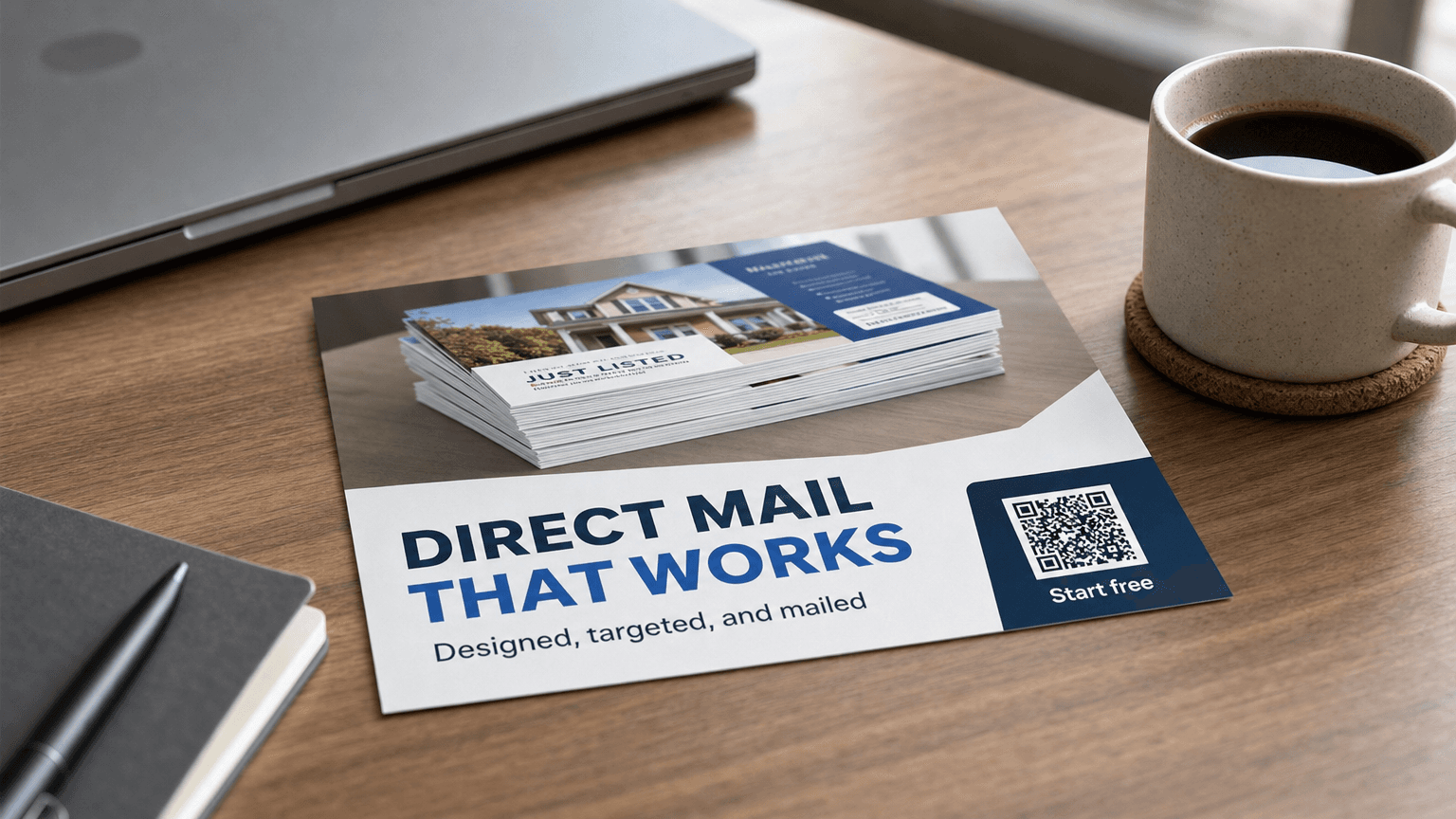
- Magic Mailer's AI generates a print-ready, on-brand postcard in about 60 seconds, with automatic QR code validation and smart local targeting built in.
A postcard lives or dies in about three seconds. That is how long a piece of mail has to earn attention before it lands in the recycling bin. Good design does not need to be complicated, but it does need to be deliberate: the right size for your goal, a headline that speaks to the reader's situation, a single offer, and a layout that guides the eye from front to back. This guide covers every design decision you will face, from choosing a size to getting the file print-ready, so you can put a card in the mail with confidence.
Standard Postcard Sizes: Which One to Choose
Postcard size determines postage rates, visual impact, and how much copy and imagery you can fit. Smaller formats qualify for lower postage; larger formats command more shelf space on the counter or table. Choose based on your offer complexity and budget, not on what looks most impressive.
| Size | Common Name | Best For | Notes |
|---|---|---|---|
| 4" x 6" | Standard | Appointment reminders, single-offer campaigns, high-volume sends | Qualifies for First-Class postcard rate; least costly to print |
| 5" x 7" | Large | Seasonal promotions, neighbourhood awareness, moderate copy | Most popular all-around size; good image-to-text balance |
| 6" x 9" | Jumbo | New business launches, premium services, detailed offers | Stands out in a mixed mailbox; room for secondary messaging |
| 6" x 11" | Giant | High-impact campaigns, luxury brands, event invitations | Highest visual impact; typically at flat (letter) postage rate |
For most local service businesses, a 5" x 7" card hits the right balance of cost and real estate. If your offer requires a list of services or a detailed coupon, step up to 6" x 9". Reserve 6" x 11" for campaigns where visual drama is part of the brand message.
Front vs. Back Layout: What Goes Where
The front of a postcard is your billboard: one strong image, one powerful headline, and your brand. The back is where you close. Postal regulations require the back to carry the address block and indicia (postage marking), which leaves roughly the left two-thirds of the back for your message. Work within that constraint, not against it.
Front panel checklist:
- Dominant visual that reflects the offer or the customer's desired outcome
- Headline: no more than 10 words, tied to the reader's situation or goal
- Brand logo and primary colour so the piece is instantly recognisable
Back panel checklist:
- Sub-headline that restates the offer in plain language
- Two to four concise bullet points on what the reader gets
- A single call to action (one URL, one phone number, or one QR code, not all three)
- Return address in the upper-left corner
- Address block on the right side of the card (required for automated mail processing)
- Optional: a small trust signal such as a recognisable certification or a short client quote
Keep both panels uncluttered. White space is not wasted space; it is what makes each element readable when someone glances at the card for a few seconds.
Ready to Reach the Right Prospect at the Right Moment?
Launch a self-serve campaign with Magic Mailer, or book a call for done-for-you timing-based mailers.
Try Magic Mailer FreeWant it set up in your CRM for you? book a meeting
The Anatomy of a High-Converting Postcard
A postcard that converts shares five structural elements regardless of industry or size: a reader-focused headline, one clear offer, a single call to action, a trust signal, and enough white space to let each element breathe. These are the components that matter most when someone moves from glancing at the card to acting on it.
1. A headline tied to the reader, not the business. The most common postcard mistake is leading with the company name or logo. Your name is not a headline. "Water in your basement after last week's rain?" is a headline. It names the reader's problem and earns the next two seconds.
2. One clear offer. Ambiguity kills response. Tell the reader exactly what they get: "$50 off your first cleaning," "Free 30-minute consultation," "10% off any order this month." One offer, stated plainly, is more compelling than three vague benefits. See the direct mail marketing guide for how offer structure affects overall campaign ROI.
3. A single call to action. Give the reader one next step. A QR code that goes to a landing page is ideal because it is trackable, requires no typing, and works in every household. If you add a phone number, make it secondary. If you add a URL, make it short. Never put a QR code, a URL, and a phone number at the same visual weight; the reader will choose "none of the above."
4. Trust signals. A single line, a logo badge, or a brief quote reduces purchase anxiety for a new prospect. A star rating, a professional association logo, or "Serving [your city] since 2010" takes up minimal space and meaningfully increases credibility with readers who have never heard of you.
5. White space. Crowded cards feel urgent in a bad way: too much information signals desperation. Leave breathing room around every element. A card with 30% of its surface as white space will consistently outperform a card where every square inch is used.
Print Fundamentals: Bleed, Safe Zone, Resolution, and the Address Block
Print specifications are not optional extras. A file that does not meet the printer's requirements will be rejected, delayed, or delivered with white borders and cropped content. Bleed, safe zone, resolution, and colour mode each serve a specific purpose. Understanding these terms once, before you set up your design, prevents the most common and costly print errors.
Bleed. When a postcard is cut from a larger printed sheet, the cut is never perfectly precise. Bleed is the extra artwork you extend beyond the finished size, typically 0.125" (1/8") on every edge. Any background colour or image that runs to the edge of the card must extend into the bleed area, or you will see a thin white line on the finished card.
Safe zone (or quiet zone). The mirror image of bleed on the inside: keep all critical content, including text, logos, and the call to action, at least 0.125" to 0.25" inside the finished edge. Anything outside the safe zone risks being clipped.
Resolution. Print files should be at least 300 dpi (dots per inch) at the final print size. A high-resolution photo that looks sharp on a screen at 72 dpi will look blurry in print. If you are using stock images, download the largest file size available. If you are using your own photography, shoot at the highest resolution your camera offers.
Colour mode. Printers use CMYK (cyan, magenta, yellow, black) rather than the RGB your screen uses. A vivid orange on your monitor may print slightly different in CMYK. If brand colour accuracy matters, specify your colours using Pantone references and request a proof before a full print run.
Address block requirements. Canada Post and USPS both specify where the delivery address and postage indicia must sit. The address panel is typically on the right half of the back of the card. Your printer's template will mark this zone; do not place design elements inside it. The return address goes in the upper left. Leave the lower-right area clear for barcoding.
For more on how print quantities affect your per-piece cost, see postcard marketing cost.
Common Design Mistakes (and How to Avoid Them)
Even experienced marketers make these errors. Most stem from the same impulse: wanting to include more on the card than the format can hold. Knowing the six most common mistakes before you open a design tool is the fastest path to a card that gets read and acted on, rather than one that gets recycled.
Too many fonts. Limit yourself to two typefaces: one for headlines, one for body copy. More than two creates visual chaos and signals a lack of professionalism.
Low-contrast text. Grey text on a white background, or white text on a light-coloured image, fails the "glance test." Dark text on a light background, or white text on a dark, image-free area, is safest. Always check contrast at the actual print size, not only on a large monitor.
Headline that sells the business instead of addressing the reader. "Award-winning lawn care in [city]" is about you. "Ready for a lawn the neighbours notice?" is about the reader. Lead with their goal or their problem.
QR codes that are too small. A QR code smaller than 1" x 1" may not scan reliably, particularly on lower-end phone cameras. Give it space. Test it with multiple devices before printing.
Missing or incorrect bleeds. Submitting a file at exactly the finished size, with no bleed, is the number-one cause of print rejection or visible white borders. Always add the bleed when you set up your document.
Cramming in too much copy. A postcard is not a brochure. If your offer requires more than 80 words to explain, the offer is too complicated for a postcard. Simplify the offer, not the design.
Ready to Reach the Right Prospect at the Right Moment?
Launch a self-serve campaign with Magic Mailer, or book a call for done-for-you timing-based mailers.
Try Magic Mailer FreeWant it set up in your CRM for you? book a meeting
How Magic Mailer Handles Design, Print Specs, and QR Codes
Magic Mailer's AI postcard tool handles the technical side of postcard design automatically, generating a print-ready card in about 60 seconds. The tool pulls your logo and brand colours, applies correct bleed and safe-zone settings, and outputs a CMYK file configured to meet printer requirements, without any design software knowledge on your part.
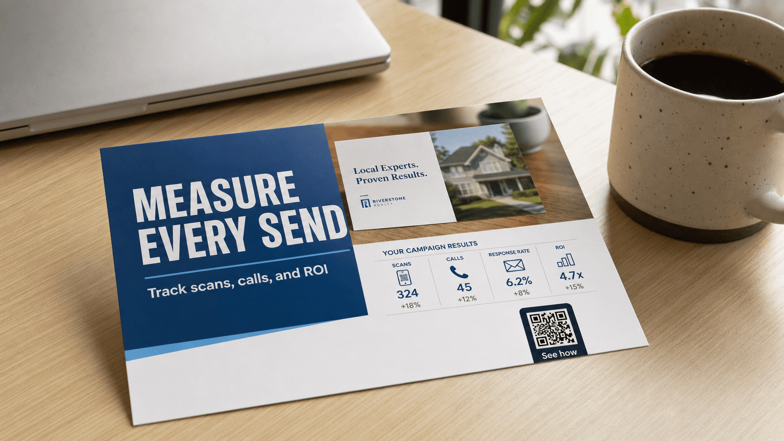
The generator places a QR code on the card automatically and validates that it scans correctly before the file is finalised. You can point the QR code at any URL: a landing page, a booking form, a phone-click link, or a promotional offer page. Every scan is tracked so you can measure response from a specific campaign.
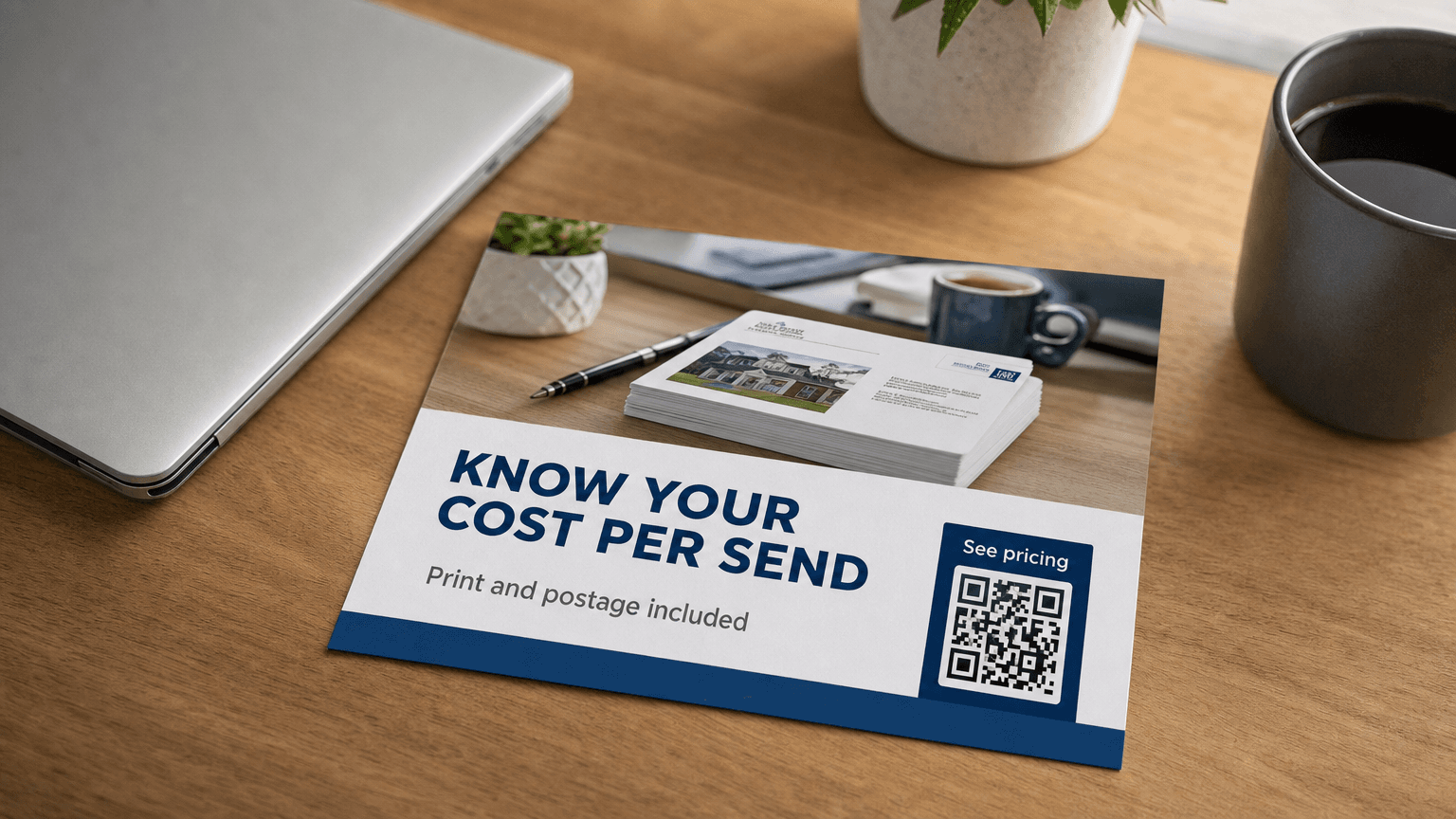
From there, Magic Mailer's smart local targeting builds your recipient list and the platform handles printing, postage, and delivery end to end. Pricing in Canada starts at CA$3.31 per piece for a single send and drops to CA$1.53 per piece at 5,000+ pieces, printing and postage included. A Free Starter plan includes 1,000 build credits with no credit card required, so you can build and preview a card before committing to a send.
For businesses that want to reach prospects at a specific moment, the new listings service sends a card to homeowners the moment their property lists, using real-time listing data. It operates on the same print-and-deliver infrastructure, with no manual list management required.
If you are weighing direct mail against digital advertising, postcard marketing vs digital ads runs through the trade-offs directly.
Ready to design your first card? Magic Mailer's AI postcard tool walks you through the process from logo upload to finished, print-ready file in a single session.
Frequently Asked Questions
What is the most popular postcard size for direct mail?+
The 5" x 7" (large) postcard is the most widely used size for direct mail campaigns. It offers a strong balance between visual impact and cost, with enough space for a compelling image, headline, offer, and call to action without the higher postage cost of oversized formats.
What does 'bleed' mean in postcard design?+
Bleed refers to artwork that extends 0.125" (1/8") beyond the finished trim size on every edge. Because printing presses cut cards from larger sheets and cuts are never perfectly precise, background colours and full-bleed images must extend into the bleed area or the finished card will show thin white borders.
How many calls to action should a postcard have?+
One. A single, prominent call to action, whether a QR code, a phone number, or a short URL, consistently outperforms multiple competing options. When readers face three equal options, they tend to choose none. Pick the tracking method that best fits your offer and feature it prominently.
What resolution should a postcard file be?+
Print files should be at least 300 dpi (dots per inch) at the final finished size. Images that look sharp on screen at 72 dpi will print blurry. If sourcing stock photography, always download the largest file available, and set up your design document at 300 dpi from the start.
Do I need a designer to create a print-ready postcard?+
Not with AI-powered tools like Magic Mailer. The platform pulls your logo and brand colours, builds an on-brand layout, applies correct bleed and safe-zone settings, validates the QR code, and outputs a print-ready file, all without any design software knowledge. For businesses with a specific brand style guide, a professional designer can still refine the output before sending.
Sources
- ANA 2023 Response Rate Report: house-list response rate ~5.3%, prospect-list ~2.9%; house-list ROI ~161%; cost per acquisition US$19 (house list) vs US$43 (prospect list); postcards used by 76% of marketers mailing house lists. — ana.net
- Lob 2024 State of Direct Mail: 84% of marketers rate direct mail their highest-ROI channel; 85% report best response rates; 84% report best conversion rates. — lob.com
Ready to Reach the Right Prospect at the Right Moment?
Launch a self-serve campaign with Magic Mailer, or book a call for done-for-you timing-based mailers.
Try Magic Mailer FreeWant it set up in your CRM for you? book a meeting